A Notification Timeline using React
Co-Founder, @CreoWis | Teacher, @tapaScript | Founder, @ReactPlay | YouTuber | Writer | Human
Introduction
It's been a while I have done much with React. When I was trying it out with simple state management, in-built hooks, basic styling, and managing events, I thought, why not build something useful? That's when the idea of building a simple, light-weight notification-timeline came into my mind.
So what is notification-timeline?
- As the name indicates, it notifies you sooner a notification arrives.
- It helps you in reading through your notifications in a timed sorted manner. That's where the timeline comes from.
- You can mark the notifications as read.
- You can identify what notification was received and when.
- Few more customization capabilities that we will discuss a bit later.
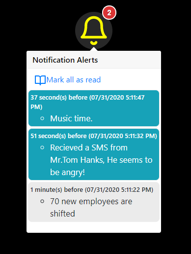
How does it look?
The basic look and feel contain a bell icon along with a number of unread notifications for you to look into.
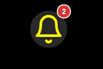
You click on the bell icon to open up a pop-over to read the notifications and mark them as read if required.
TL;DR
In this article, I am going to explain some source code at a high level. Please stick to it. I am sure, you will have some take-away from it.
In case, you want to get to the code or the demo early, here are the details:
Demo
You can access the demo from here: https://notify-timeline.netlify.app/
Source Code
All the Source Code are here in the git repo. If you like the work, please show your support with a star for the repo.
Yayyy, it is available as npm
Did you know, this component is also available as an npm? Yeah! you can download and install it using,
npm i react-notification-timeline
or
yarn add react-notification-timeline
Once installed, it can be imported into your React project as,
import NotifyMe from 'react-notification-timeline';
Use the component as,
<NotifyMe
  data={data}
  storageKey='notific_key'
  notific_key='timestamp'
  notific_value='update'
  heading='Notification Alerts'
  sortedByKey={false}
  showDate={true}
  size={64}
  color="yellow"
/>
For more details about the properties and customizations, please read it from here.
Please give it a try and let me know how it goes. Almost nothing is bug-free! Feel free to be a contributor if you would like to find-try-fix bugs or add features to it. You are most welcome.
Understanding the 'How' part
Thank you for reading through it so far! This section of the article is going to explain a few important parts of the source code and the basic logic around it. Here is the direct link to the component file.
First is the data
The notification-timeline component expects data in the following format,
 [
     {
       "update":"70 new employees are shifted",
       "timestamp":1596119688264
     },
     {
       "update": "Time to Take a Break, TADA!!!",
       "timestamp":1596119686811
     }
  ]
The object must have two properties.
- timestamp: The timestamp of the time a message was generated. This must be of type long that represents a timestamp value.
- update: The message to show a notification.
Note: The key names, timestamp and update can be customized as explained in the properties section.
States to manage
The hook useState returns a pair. First is the current state and second is an updater function. We usually take advantage of array destructuring to assign the values. The initial state value can be passed using the argument.
The notification component manages few states using useState,
- To show the unread message count
const [showCount, setShowCount] = useState(false); - How many unread messages
const [messageCount, setMessageCount] = useState(0); - To show the message panel on click of the bell icon
const [show, setShow] = useState(false); - To set the click target of the message panel
const [target, setTarget] = useState(null); - To maintain a read index. This is to determine, how far the messages were read so that the unread messages can be shown with a different style.
const [raedIndex, setReadIndex] = useState(0);
Handle the side effects
The hook useEffect is used for handling any sort of side effects like state value changes, any kind of subscriptions, network requests, etc. It takes two arguments, first a function that will be invoked on the run and, an array of the values that will run the hook.
It runs by default after every render completes. However, we can make it run whenever a particular value changes by passing it as the second parameter. We can also make it run just once by passing an empty array as the second parameter.
The notification component handles the side effect of the data changes. Whenever a new notification arrives, the data gets muted and we need to handle this side effect.
useEffect(() => {
        if (!sortedByKey) {
            data.sort((a, b) => b[key] - a[key]);
        }

        let readItemLs = reactLocalStorage.getObject(storageKey);
        let readMsgId = Object.keys(readItemLs).length > 0 ? readItemLs['id'] : '';

        let readIndex = (readMsgId === '') ? data.length :
                           data.findIndex(
                               elem =>
                                   elem[key] === readMsgId);


        readIndex === -1 ? readIndex = data.length : readIndex;
        setReadIndex(readIndex);

        (data.length && readIndex) > 0 ?
            setShowCount(true) : setShowCount(false);
        setMessageCount(readIndex);

    }, [data]);
On data change,
- Check and sort by timestamp, if required.
- We track the last read message by adding the timestamp of it into the local storage. We check if any last read item id is in the local storage.
- We set the message count, last read index accordingly.
The rendering part
Last, the render part. We have a bell icon that shows the unread message count and method to handle the click event.
<div className="notification-container">
    <div className =
              {
                 showCount ?
                   'notification notify show-count' :
                       'notification notify'
               }
           data-count={messageCount}
            onClick={event => handleClick(event)}>
                    <Bell color={bellColor} size={bellSize} />
     </div>
</div>
Important to note here, we use the data-* attribute to embed custom data. In this case, it is the unread message count using the data-count attribute. Read more about HTML data-* attribute from here.
Next, the handleClick() method handles to show the pop-over with the notification messages. To do that, we just need to update couple of states,
// Handle the click on the notification bell
const handleClick = (event) => {
    setShow(!show);
    setTarget(event.target);
}
That's all for covering all the important parts here. I have used feather icons for the bell icon and react bootstrap for the message pop-over component.
Concluding with a plan
I would like to enhance the code better as in, I can make it more precise and short. There are lots of scopes to improve this component with additional features like,
- Showing total message count.
- Mark as unread.
- Limiting the total number of notifications and flush out.
- Read/Unread Selected notification messages.
- Delete all the notification messages.
- Better persistence hook, other than the browser local storage.
- Better look-and-feel.
That's all for now. I am happy to share my learning with you and that motivates me further to learn more.
If it was useful to you, please Like/Share so that, it reaches others as well. To get e-mail notifications on my latest posts, please subscribe to my blog by hitting the Subscribe button at the top of the page. You can also follow me on Twitter @tapasadhikary.
The cover photo is an improvisation on top of the awesome work by freepik.