

The story of the custom scrollbar using CSS
You can customize the scrollbar with a bit of CSS easily. Learn how to do it with a step-by-step explanation.


A scrollbar is helpful and evident when a web page's content overflows beyond the visible areas. The look and feel of a scrollbar depend on the browser's implementation. A scrollbar's look differs from Google Chrome to Firefox to Safari. In most cases, the default look is not that charming.
The good news is that we can customize the look of a scrollbar easily with a few lines of CSS. In this article, we will learn that.
First is the HTML part. Let's create a paragraph with some random texts and enclose it in a div element. We will add a class to the div so that we can add styles to it.
<div class="scroll-demo">
  <p>
       Lorem ipsum dolor sit amet, consectetur adipiscing elit.
Pellentesque ullamcorper diam ac nisl porttitor, non porttitor
sapien vehicula. Cras vel scelerisque arcu. Cras nec sodales sem.
Aenean viverra semper augue, eu pellentesque lacus laoreet et.
In porttitor quam et turpis facilisis aliquet. Morbi in urna vel tortor
finibus maximus in ut augue. Sed posuere semper condimentum.
Quisque lacinia ut sem eget egestas. Donec risus est, porttitor
vitae mauris quis, pretium tincidunt ex. Suspendisse est libero,
fringilla in aliquet ut, faucibus quis nibh. Sed eget ex eu orci ullamcorper
molestie. Aenean pharetra quis neque non imperdiet. Mauris euismod
mattis sapien, id gravida nunc pulvinar ut. Vestibulum diam augue, egestas
ut odio ut, placerat molestie metus.
  </p>
</div>
Next, let us apply some styles to the div such that we get a scrollbar to play with. We have given it a comparatively smaller width and the overflow attribute set as auto for the scrollbar to appear.
.scroll-demo {
  width: 300px;
  height: 200px;
  overflow: auto;
  padding: 5px;
  border: 1px solid #ebebeb;
}
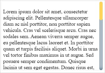
Great!!! At this stage, if we render the div on the web browser, it will look like this:
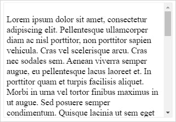 Rendering on Google Chrome
While the scrollbar may look like a simple control, you will be surprised to know that it has some essential parts. We need to be aware of these parts to customize them better. Let us now look into different parts of a scrollbar and see what purpose each of them serves.
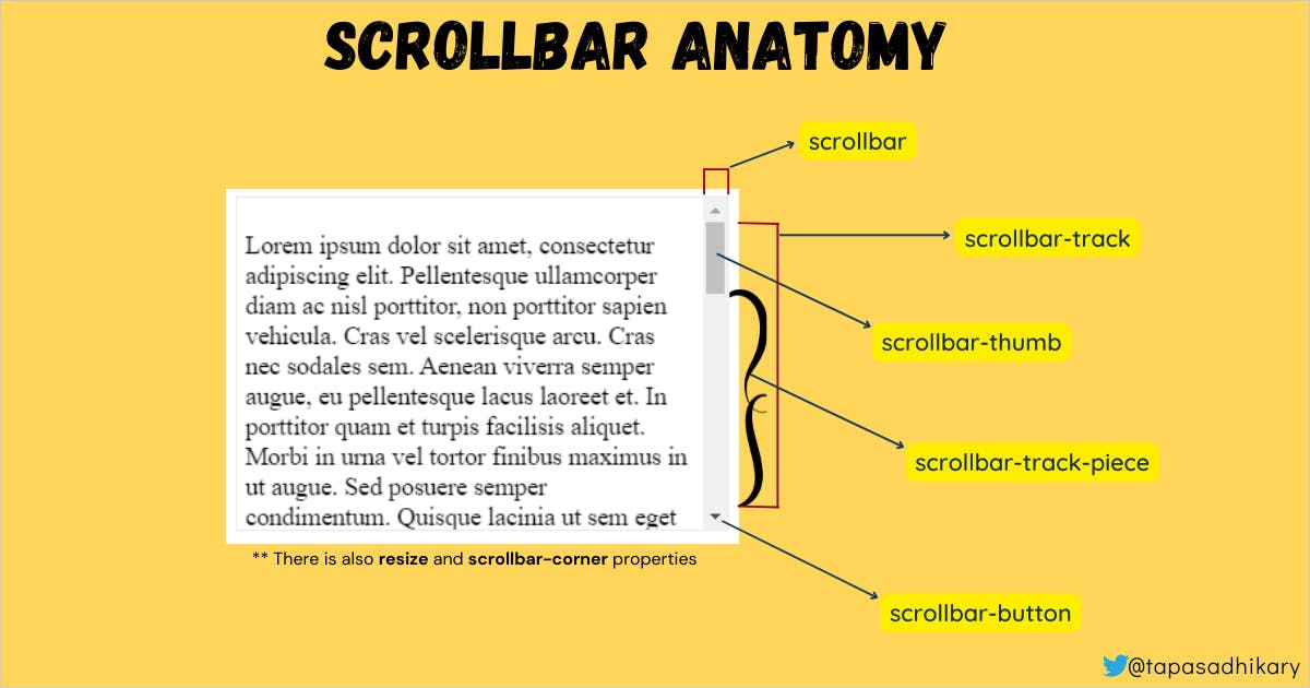
scrollbar: It is the entire scrollbarscrollbar-button: The top and bottom portion of the scrollbar.scrollbar-track: The line on which it scrolls.scrollbar-thumb: The handle we use for scrolling.scrollbar-track-piece: The portion of the scroll track not covered by the thumb.scrollbar-corner: The bottom-right corner.resizer: The marker or handle to resize it.
CSS pseudo-elements are available to style based on each of the above properties.
::-webkit-scrollbar
::-webkit-scrollbar-button
::-webkit-scrollbar-track
::-webkit-scrollbar-track-piece
::-webkit-scrollbar-thumb
::-webkit-scrollbar-corner
::-webkit-resizer
Please note that these CSS pseudo-elements are not included as the standard for implementation by all the browsers. That's why these pseudo-elements work on chrome, safari, edge, and opera but do not work on Firefox yet. Don't worry. We have some alternatives for Firefox, and we will see that in a while.
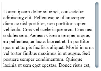
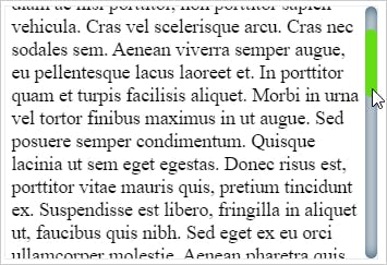
Now let us put some width to our scrollbar and background to its track. So we have defined them using the ::-webkit-scrollbar and ::-webkit-scrollbar-track pseudo-elements.
.scroll-demo::-webkit-scrollbar {
  width: 10px;
}

.scroll-demo::-webkit-scrollbar-track {
  box-shadow: inset 0 0 10px #143d59;
  border-radius: 50px;
}
Here is how the scrollbar will look with the above changes:
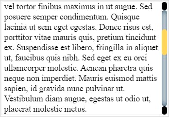
Now we want to style the scroll thumb. Let us apply a background color to it and a border-radius value. We will do it using the ::-webkit-scrollbar-thumb pseudo-element.
.scroll-demo::-webkit-scrollbar-thumb {
  background: #ffd55a;
  border-radius: 50px;
}
Take a look! Now the thumb color is changed as well.
How about changing the thumb color on the hover? Well, that's easy. We can use :hover to apply the color.
.scroll-demo::-webkit-scrollbar-thumb:hover {
  background: #64dd17;
}
So when we mouse over the scroll-thumb, the color changes accordingly.
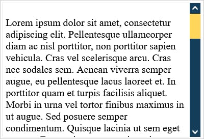
It's time to customize the top and bottom scroll buttons. Let's use the ::-webkit-scrollbar-button pseudo-element to customize it. Here we are applying a black color with a border-radius to both the scroll buttons.
.scroll-demo::-webkit-scrollbar-button {
  background: black;
  border-radius: 10px;
}
The changes are applied, and the entire scrollbar look is changed to a custom look.
You can go as creative as possible to customize the scrollbar using these pseudo-elements. Usages of gradients make it very attractive. Please explore. One word of caution is please keep the balanced color contrast when you customize the scrollbar.
Alright, so we understood how it works, but still, it doesn't work on Firefox. Let's learn the workaround to it.
Custom Scrollbar and Firefox
None of the pseudo-elements works on Firefox as of now. However, you can use the scrollbar-color and scrollbar-width style elements to customize the scrollbar on Firefox.
.scroll-demo {
  width: 300px;
  height: 200px;
  overflow: auto;
  padding: 5px;
  border: 1px solid #ebebeb;

  /* below styles are for Firefox */
  scrollbar-color: #ffd55a #143d59;
  scrollbar-width: auto;
}
For scrollbar-color, the first color applies to the scrollbar thumb, the second one to the scrollbar track. The scrollbar-width can have auto, thin, or none values. Here is what the scrollbar looks like after applying the above styles:
Codepens to Explore
Time to explore it further and do hands-on. This codepen has all the code we have used in the article. Please feel free to update it with your creativity and make a super customized scrollbar. Don't forget to share your work in the comment below.
Here is another Codepen I have created with the code better organized. You can check it out as well as a reference.
That's all for now. I hope you found this article insightful and helped you learn something new. The kid-and-dog illustration in the cover image was taken as a free download from the clipartmax.
I share my knowledge on,
- 🌐 Web Development(JavaScript, ReactJS, Next.js, Node.js, so on...)
- 🛡️ Web Security
- 💼 Career Development
- 🌱 Opensource
- ✍️ Content Creation
Let's connect,