

I made a photo gallery with CSS animation. Here’s what I learned.


The vanilla CSS(without any external JavaScript and CSS libraries) allows animation of HTML elements using CSS properties. This is very powerful and quite simple to learn and use.
As a beginner at CSS animation, I have learned some cool things and made a photo gallery 🖼️. This article is all about sharing that knowledge with you with a step-by-step approach. I hope you find it useful.
If you are using CSS animation already, read this article for fun. Feel free to comment to let us know some of the tips and tricks you use.
Photo Gallery
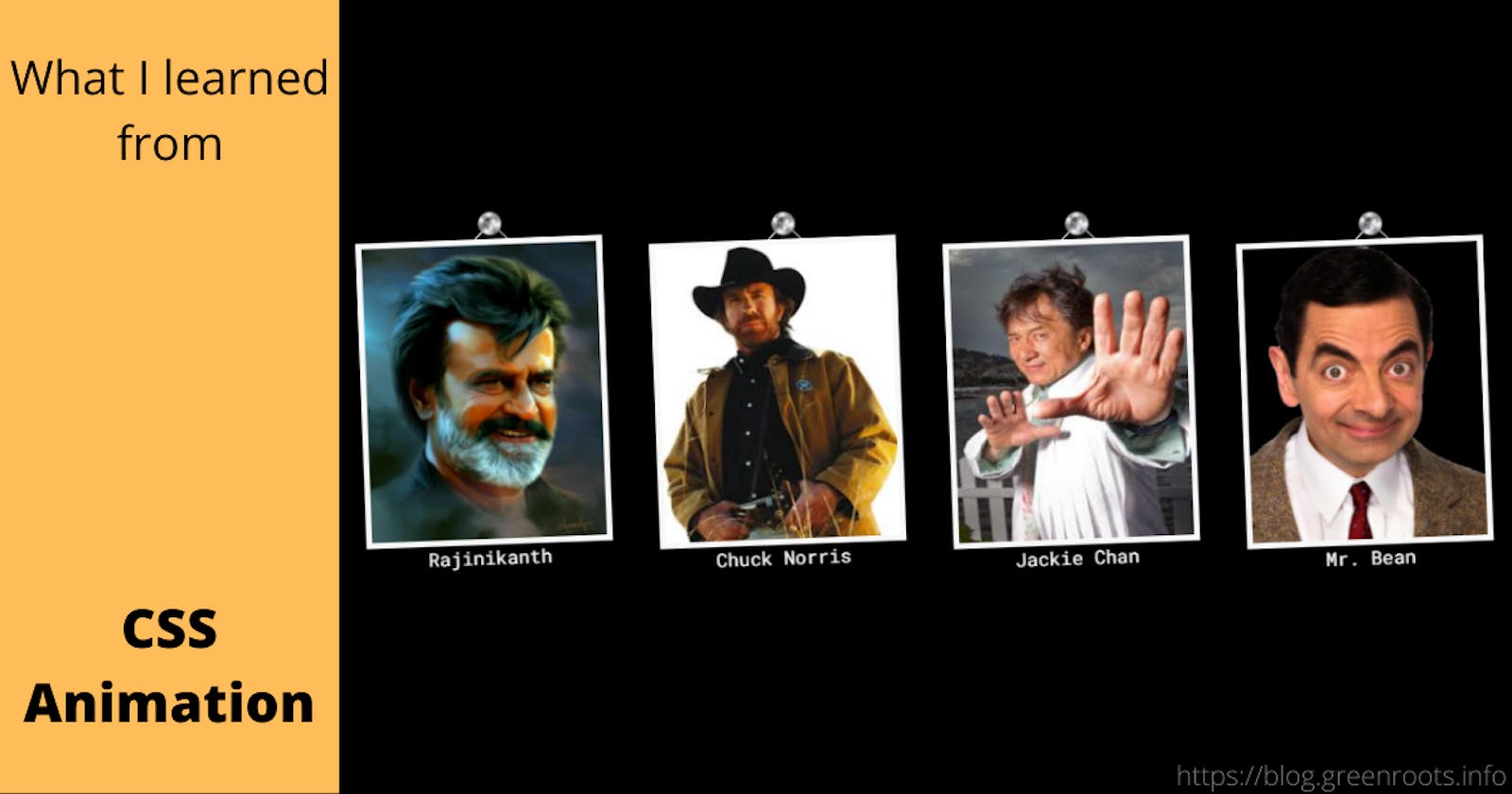
A photo gallery is a collection of photos. How about creating a gallery of some rocking stars from the entertainment industry? To put some animations behind, let us hang their photos from the wall and put a wave effect to make it feel awesome. The animation will stop if you try hovering on the photos.
At the current state, the gallery looks like this. Just check if you know all the characters there 😎.
TL;DR
This article is mostly aimed at beginners like me. Hence expect it to be a bit lengthy and tutorial type with a step-by-step approach. If you want to jump to the code and the working demo sooner, here are the links:
- A demo with all the examples: http://css-animation-fun.netlify.app/
- Github link to the Source Code: https://github.com/atapas/learn-css-animation
CSS Animation & Properties
The CSS animation property helps animating many of the CSS properties. We can animate height, width, color, font, background-color, etc., where there are a few properties such as background-image that can not be animated.
Here is the complete list of CSS properties can be animated using the animation property.
CSS animation property has a bunch of sub-properties that define the animation characteristics.
@keyframes animation-name{
  /* animation actions to come here */
}

.element {
   animation: animation-name
             animation-duration
             animation-timing-function
             animation-delay
             animation-direction
             animation-iteration-count
             animation-fill-mode
             animation-play-state;
}
Note, the above declaration is a short-hand declaration. We will be able to use these properties separately as well,
@keyframes move{
  /* animation actions to come here */
}

.element {
  animation-name: move;
  animation-duration: 0.5s;
  animation-timing-function: linear;
  animation-delay: 2s;
  animation-direction: alternate;
  animation-iteration-count: infinite;
  animation-fill-mode: none;
  animation-play-state: paused
}
- animation-name: The name of the
@keyframesdefined for the transition. A@keyframesmust be defined for each of the animation need.A
keyframein animation and filmmaking is a drawing that defines the starting and ending points of any smooth transition. - animation-duration: The time duration that takes for an animation to complete one complete cycle.
- animation-timing-function: This property specifies the speed(acceleration) curve of the animation. There are existing functions such as,
linear,ease,ease-in,ease-in-out,ease-out. We can also write a custom function using thecubic-bezier(n,n,n,n)function. - animation-delay: It specifies the time delay to start the animation.
- animation-iteration-count: It specifies the number of times we should play the animation. We can use the value
infiniteto play it in a loop. - animation-direction: It specifies if the animation should be played in a particular direction such as,
forward(normal),reverse,alternate,alternate-reverse. - animation-fill-mode: With this property, we can specify a style for the element when the animation is not playing.
- animation-play-state: This property is to specify if an animation is running or paused.
A Simple Example - Animate with Colors
Let us get started with a simple example to apply the animation properties to a div element. In this example, we want to change the background color and text color of the div element with an animation-duration of 5 seconds.
First, create a div element.
  <div class="simple">
     I'm so animated, but I animate once!
  </div>
Create a keyframe to define the animation action. In this case, we want to change the background and text colors. The @keyframes rule specifies the start and end of the animation with two properties, "from" and "to" (which represents 0% (start) and 100% (complete)).
  @keyframes simple {
    from {background-color: orange; color: black;}
    to {background-color: green; color: white;}
  }
Note the animation-name is simple in this example. The next thing is to apply the animation on the div element with this name and other sub-properties.
  div.simple {
     width: 80%;
     height: 400px;
     padding: 10px;
     border-radius: 4px;
     text-align: center;
     animation-name: simple;
     animation-duration: 5s;
  }
Here goes the example running in the Codepen for you to explore, fork, and edit.
Keyframes with the percentage properties
Animation actions are defined with the @keyframes rule. We have seen the usage of the from and to attributes. Now we will learn how to specify the actions with percentages such as 0%, 25%, 50%, 75%, 100%, etc.
In this example, we will change the background color and text color of a div element on the percentage breaks. Here is the @keyframes rule,
@keyframes percentage {
  0% {background-color: orange;}
  25% {background-color: green; color: white;}
  50% {background-color: white; color: black;}
  100% {background-color: red; color: white;}
}
Next, apply this rule with the name(percentage) to the div.
div.percentage {
  width: 80%;
  height: 400px;
  background-color: orange;
  padding: 10px;
  border-radius: 4px;
  text-align: center;
  animation-name: percentage;
  animation-duration: 5s;
}
Here is the Codepen link to explore this example.
Let's Move it!
So far, we have explored the animation-name and animation-duration properties. Let us now explore three more properties, animation-delay, animation-iteration-count and animation-direction. This time. We will use these properties on the background-color, color, left, and top properties of a div element.
As usual, let us first create the div element.
<div class="move">I'm moved!</div>
Define the @keyframes rule to change the colors and positions.
  @keyframes move {
    0% {background-color: orange; left: 0px; top: 0px;}
    25% {background-color: green; color: white; left:200px; top:0px;}
    50% {background-color: red; color: white; left:200px; top:200px;}
    75% {background-color: white; color: black; left:0px; top:200px;}
    100% {background-color: yellow; color: black; left:0px; top:0px;}
  }
Last, use the animation properties. Notice the animation-* properties here. We have used the name as the same as we defined with the @keyframes rule. An animation duration of 5 seconds is used here. The animation starts with a delay of 2 seconds and runs infinitely with an alternate direction.
  div.move {
     width: 100px;
     height: 100px;
     color: #000000;
     background-color: orange;
     padding: 10px;
     border-radius: 4px;
     position: relative;
     text-align: center;
     animation-name: move;
     animation-duration: 5s;
     animation-delay: 2s;
     animation-iteration-count: infinite;
     animation-direction: alternate;
    }
Here goes the Codepen link for you to explore further. How about you try a negative value for the animation-delay? How about trying out another animation-direction?
See how I have modified the same example to run the animation 3 times instead of an infinite count.
Use the Shorthand notation
So far, we have used the animation properties separately. However, we can use a shorthand notation to use them in the single animation property.
The same example like the above can be defined like,
div.sh {
  width: 100px;
  height: 100px;
  color: #000000;
  background-color: orange;
  padding: 10px;
  border-radius: 4px;
  position: relative;
  text-align: center;
  animation: move 5s linear 1s infinite alternate-reverse;
}
Please notice the animation property here with all the property values together. You can explore it further with this Codepen example.
Let's race with the Timing function
In this example, we will learn about animation-timing-function property. The animation-timing-function property specifies the acceleration curve of the animation. The property values are,
linear: With linear, an animation runs with the same speed from start to end. This is the default value.ease: With ease, an animation starts slowly, then fast, then ends slowly.ease-in: This enables an animation with a slow start.ease-out: This specifies an animation with a slow end.ease-in-out: With this, an animation with a slow start and end.cubic-bezier(n,n,n,n): Define your own value for a custom function.
Let us use all of these. To do that, we will first create a few div elements to apply each of the functions explained above.
<div class="speed" id="linear">linear</div>
<div class="speed" id="ease">ease</div>
<div class="speed" id="easeIn">ease-in</div>
<div class="speed" id="easeOut">ease-out</div>
<div class="speed" id="easeInOut">ease-in-out</div>
<div class="speed" id="custom">Custom</div>
Next is the @keyframes rule to move the divs.
@keyframes move {
  0% {background-color: orange; left: 0px; top: 0px;}
  100% {background-color: green; color: white; left: 300px; top: 0px;}
}
Define the animation-name as a common animation for all the divs.
div.speed {
   width: 100px;
   height: 50px;
   color: #000000;
   background-color: orange;
   padding: 10px;
   margin: 5px;
   border-radius: 4px;
   position: relative;
   text-align: center;
   animation: move 5s infinite;
}
Finally, use different animation-timing-function values for each of the divs.
div#linear {
  animation-timing-function: linear;
}
div#ease {
  animation-timing-function: ease;
}
div#easeIn {
  animation-timing-function: ease-in;
}
div#easeOut {
  animation-timing-function: ease-out;
}
div#easeInOut {
  animation-timing-function: ease-in-out;
}
div#custom {
  animation-timing-function: cubic-bezier(0.1, 0.7, 1.0, 0.1);
}
Here is the output. All the divs are racing.
Bunny and Ginny as Multiple Animations
We can apply multiple animations with a comma(,) separated values, like this:
animation: move-h 3s linear infinite alternate,
    shape 3s ease-out infinite alternate;
For this example, define two div elements.
<div class="multiple" id="multiple-h">I'm Bunny</div>

<div class="multiple" id="multiple-v">I'm Ginny</div>
Next is to define the @keyframes rules. Here we will have three rules. One to move the div horizontally, one vertically, and another to change the shape of them.
@keyframes move-h {
  0% {background-color: orange; left: -200px; top: 0px;}
  25% {background-color: green; color: white; left: 0px; top:0px;}
  50% {background-color: white; color: black; left: 200px; top: 0px;}
  100% {background-color: red; color: white; left: 0px; top: 0px;}
}

@keyframes move-v {
  0% {background-color: red; color: white; left: 0px; top: 200px;}
  25% {background-color: white; color: black; left: 200px; top:200px;}
  50% {background-color: green; color: white; left: 200px; top: 0px;}
  100% {background-color: orange; left: -200px; top: 0px;}
}

@keyframes shape {
  0% {transform: scale(.3);}
  25% {transform: scale(.5);}
  100% {transform: scale(1);}
}
Last is to call the animation property with the required values. Note, we are applying multiple animations here.
div#multiple-h {
  animation: move-h 3s linear infinite alternate,
    shape 3s ease-out infinite alternate;
}

div#multiple-v {
  animation: move-v 3s linear infinite alternate,
    shape 3s ease-out infinite alternate;
}
Here is the Codepen example to see how the bunny and ginny divs moving around and changing shape and color.
Finally, the Photo Gallery
Alright, let us do a quick recap of things we have learned so far.
- We have learned about the
@keyframesrule. - We have defined animation properties like name, duration, delay, time-function, direction, and iteration-count.
- We have learned about the shorthand way of declaring the
animationproperty.
Great! in this final example, we will use all of them along with another useful property called animation-play-state.
First thing first, let us use the HTML5's figure element to define four images with captions. These four images are the photo frames used in our gallery.
<div>
        <figure class="wave">
            <img src="./images/rajni_image.jpg" alt="rajni"></img>
            <figcaption>Rajinikanth</figcaption>
        </figure>
        <figure class="wave">
            <img src="./images/chuckn_image.png" alt="chuck"></img>
            <figcaption>Chuck Norris</figcaption>
        </figure>
        <figure class="wave">
            <img src="./images/jackiechan_image.png" alt="chan"></img>
            <figcaption>Jackie Chan</figcaption>
        </figure>
        <figure class="wave">
            <img src="./images/bean.png" alt="bean"></img>
            <figcaption>Mr. Bean</figcaption>
        </figure>
 </div>
Next, we want to add animations to the photo frames such that they wave(or swing) in the left and right directions. So, time to create our @keyframes rule.
@keyframes wave {
  0% { transform: rotate(10deg); }
  100% { transform: rotate(-10deg); }
}
We have created a rule to rotate the images a few degrees left and right. Alright, let's apply then.
.wave {
  float: left;
  margin: 20px;
  animation: wave  ease-in-out 0.5s infinite alternate;
  transform-origin: center -36px;
}
At this point, we should see the photo frames are swinging left and right. Next, we want to stop the animation when someone hovers on a photo frame. We will use the animation-play-state property value as paused for this.
.wave:hover {
  animation-play-state: paused;
  cursor: pointer;
}
That's all for all the functionality we needed. But wait, we also have to make it look elegant. Use the following CSS rules to make the photo frames look like hanging from a wall using a screw head.
.wave img {
    border: 5px solid #f8f8f8;
    display: block;
    width: 200px;
    height: 250px;
}

.wave figcaption {
    text-align: center;
}

.wave:after{
  content: '';
  position: absolute;
  width: 20px;
  height: 20px;
  border: 1.5px solid #ffffff;
  top: -10px;
  left: 50%;
  border-bottom: none;
  border-right: none;
  transform: rotate(35deg);
}

.wave:before{
  content: '';
  position: absolute;
  top: -23px;
  left: 50%;
  display: block;
  height: 44px;
  width: 47px;
  background-image: url(https://cdn.hashnode.com/res/hashnode/image/upload/v1602040503586/FW6g79WBY.png);
  background-size: 20px 20px;
  background-repeat: no-repeat;
  z-index: 16;
}
You can see it working in this Codepen example. Feel free to explore and change.
Performance
Animating a CSS property can lead to performance concerns. We should be careful about using the animation properties. Here is a great article that explains the concerns in detail. Please have a look.
Browser Support
Here is the table that shows the browser support for the animation properties.
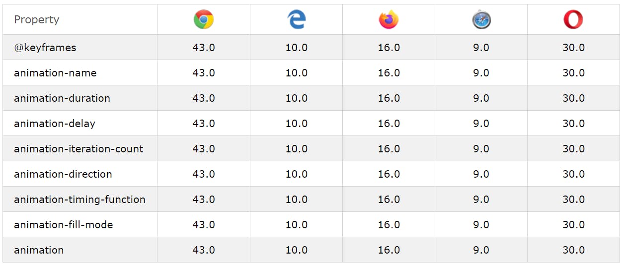 Image is taken from the https://www.w3schools.com/css/css3_animations.asp
Conclusion
If you had started this article as a beginner to CSS animation and you are here after reading it through, how do you feel? Isn't it fun? Give it a try by doing some hands-on with any fantasy project. You are going to love it.
All the source code used in this article is in the GitHub repository. Please give it a star if you liked the work. Feel free to follow it as I keep updating the source code with examples.
You may also like,
See you again with my next article soon. Until then, please take good care of yourself.
If it was useful to you, please Like/Share so that it reaches others as well. Please hit the Subscribe button at the top of the page to get an email notification on my latest posts.
You can @ me on Twitter (@tapasadhikary) with comments, or feel free to follow me.